
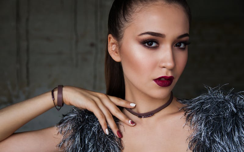
The world of editorial makeup is a playground of boundless creativity, often characterized by avant-garde techniques, exaggerated proportions, and a complete disregard for traditional beauty standards. Seen on high-fashion runways and in the glossy spreads of magazines, these looks are designed to tell a story or sell a concept rather than a wearable product. However, the true magic of makeup artistry lies in the translation—the process of distilling a complex, theatrical editorial concept into a sophisticated, wearable look for everyday life.
Understanding how to bridge the gap between the runway and the real world requires an eye for detail and an appreciation for color theory, texture, and facial structure. It is about identifying the “soul” of an editorial look and finding a way to express it with subtlety and grace.
Defining Editorial vs. Wearable Makeup
To master the art of translation, one must first understand the fundamental differences between these two styles.
Editorial makeup is conceptual. It is often created for specific lighting conditions, such as high-intensity studio strobes or professional camera lenses. Because it is meant to be photographed, the application is often heavy, textured, and prioritized for visual impact over longevity or comfort. In this realm, eyebrows might be bleached or replaced with gold leaf, and skin might be layered with high-shine gloss that would feel sticky and impractical in a grocery store.
Wearable makeup, conversely, is designed for the three-dimensional world. It must withstand natural sunlight, movement, and the passage of time. The goal is typically to enhance the wearer’s natural features, correct perceived imperfections, and provide a polished appearance that feels comfortable for hours.
The Strategy of Distillation
The key to a successful translation is the “rule of one.” Editorial looks often feature multiple high-impact elements simultaneously: a graphic neon eye, a vinyl-finish lip, and sculptural contouring. To make this wearable, a makeup artist or enthusiast must choose one focal point and soften the rest of the face to create balance.
From Graphic Liners to Subtle Definition
One of the most popular editorial trends is the use of graphic, architectural eyeliner. On the runway, this might involve sharp black lines that extend toward the temples or floating creases that defy the natural shape of the eye.
To translate this for a wearable look:
-
Scale it down: Instead of a thick, geometric shape, use a fine-tipped liner to create a subtle flick at the outer corner.
-
Change the color: Swap a harsh black for a deep plum, navy, or espresso. These shades provide the “editorial” edge without looking like a costume.
-
Soften the edges: Editorial lines are often razor-sharp. For a wearable version, use a smudged pencil or a dark eyeshadow to create a similar shape with a lived-in, smoky finish.
Translating High-Shine and Textures
Editorial artists love playing with light. This often results in “glass skin” or “wet-look” eyes created by layering thick clear glosses over pigment. While stunning in a photo, gloss on the eyelids is notorious for creasing and migrating within minutes.
To achieve the “wet” editorial look in a wearable way:
-
Use metallic shadows: High-quality metallic or cream eyeshadows can mimic the reflective quality of gloss without the mess.
-
Strategic highlighting: Instead of coating the entire face in a dewy balm, apply a liquid highlighter only to the highest points of the cheekbones and the bridge of the nose.
-
Satin finishes: Swap heavy matte foundations for satin-finish formulas that allow the skin’s natural luminosity to show through.
The Evolution of Color Theory
Editorial makeup often utilizes clashing colors or monochromatic themes that feel overwhelming in a professional or social setting. The transition here involves adjusting the saturation and the placement of the pigment.
The Neon Pop
If an editorial look features neon orange shadow from the lash line to the brow bone, the wearable version focuses on a “pop” of color. This can be achieved by applying a small amount of the bright pigment only to the inner corner of the eye or by using a neon-colored mascara on the bottom lashes while keeping the rest of the eye neutral.
Monochromatic Harmony
Monochromatic editorial looks—where the eyes, lips, and cheeks are the exact same shade of bold pink or red—can be translated by varying the textures. For instance, use a sheer red tint on the lips, a soft rosy wash on the cheeks, and a very light, diffused version of the same tone in the crease of the eye. This creates a cohesive, high-fashion feel that remains grounded and flattering.
Structural Manipulation vs. Natural Enhancement
Editorial makeup frequently uses “negative space” or heavy contouring to change the perceived shape of the face, sometimes creating an alien or ethereal appearance.
In wearable makeup, the goal shifts toward traditional “beautification.”
-
Contouring: Instead of the sharp, unblended lines seen in fashion photography, wearable contouring utilizes shades only one or two tones deeper than the skin, blended thoroughly to mimic natural shadows.
-
Brows: The “soap brow” or “feathered brow” is a direct descendant of editorial styling. To make it wearable, ensure the hairs are brushed upward but trimmed and filled in with a shade that matches the hair color, rather than leaving them stark and overly dramatic.
Product Selection for Longevity
The final step in translating editorial to wearable is the choice of medium. Editorial artists use greasepaints, glitters, and unconventional materials like dried flowers or lace. For the everyday user, the focus must be on cosmetic-grade products designed for skin health and durability.
-
Primer: A crucial step for wearable looks that editorial artists might skip. Primers ensure that the “distilled” editorial elements stay in place throughout the day.
-
Setting Sprays: These allow you to maintain a dewy, editorial-style finish while “locking” the product so it doesn’t transfer.
-
Sheer Pigments: Opt for buildable products. This allows you to control the intensity of an editorial-inspired color, making it as bold or as subtle as the occasion demands.
Frequently Asked Questions
How can I determine which editorial element will look best on my face shape?
The best way to determine compatibility is to identify your most prominent feature. If you have large eyes, focus on translating editorial eye trends like graphic shapes or bold colors. If you have defined cheekbones, focus on editorial skin finishes and highlighting techniques. The goal is to highlight your existing strengths rather than fighting against your natural bone structure.
Is it possible to wear editorial-style glitter in a professional office setting?
Yes, but it requires extreme restraint. Instead of a full glitter lid, try a “shimmer sand” approach. Apply a tiny amount of fine-milled reflective pigment only to the center of the lid or along the lower lash line. Stick to sophisticated tones like champagne, rose gold, or taupe rather than multicolored or chunky glitters.
Why does editorial makeup often look “dirty” or “messy” in person?
Editorial makeup is designed for a 2D medium. Artists often use heavy textures, unblended edges, or “ugly-cool” colors (like mustard yellow or muddy red) to create visual friction and interest in a photograph. Without the flattening effect of a camera lens and professional lighting, these textures can appear uneven or heavy to the naked eye.
How do I prevent “editorial” bold lips from bleeding or smudging during the day?
Wearable bold lips require a different application process than editorial ones. Use a clear or matching lip liner to create a wax barrier. Apply the lipstick, blot with a tissue, and then apply a second thin layer. For a truly wearable version of the “vinyl lip,” use a long-wear liquid lipstick as a base and top it with a non-sticky gloss only in the center of the lips.
Can “no-makeup makeup” be considered an editorial trend?
Absolutely. There is a specific editorial style known as “Hyper-Realism.” This involves using specialized products to mimic skin imperfections or redness to create a raw, stripped-back look. Translating this to wearable makeup usually means using spot-concealing instead of full-face foundation to let natural freckles and skin texture shine through while still looking polished.
What is the best way to practice translating these looks without feeling overwhelmed?
Start with the “Ten Percent Rule.” Take an editorial look you love and try to incorporate only ten percent of its intensity. If the look is a bold blue smoky eye, start by using a navy blue eyeliner. As you become more comfortable with the color and the comments you receive, you can gradually increase the intensity to find your personal balance.
Are there specific tools that make translating editorial looks easier?
Yes, precision tools are essential. Small, dense blending brushes allow you to place bold editorial colors with more control. A high-quality micellar water and pointed cotton swabs are also vital for cleaning up edges, as the difference between a “fashion-forward” look and a “messy” look often comes down to the cleanliness of the application.
